Digital mediator at the registrar office in Turin
Analyse registrar office and Turin and suggest a digital solution that would solve one of the found problems without changing the backend process of the office
My role:It's a team project. I participated in research, analysis, ideation, user testing, concept communication, wireframing, prototyping.
Solution:A digital mediator that guides visitors through the process and enables seamless multi language communication.
Brief
The initial brief described the central registry office of the city of Turin as the context of analysis and design.
The registry office is part of the public administration in Italy providing fundamental services related to ID cards, official certificates and changes of residence. The complexity of the services provided, the physical space and the variety of users lead to various difficulties in providing and receiving the service.
The brief has been presented with the specifications for designing the digital touchpoints of a service connected to a system that massively uses information from both sides: one of the systems that delivers the service and one of the users who have to interact with it.
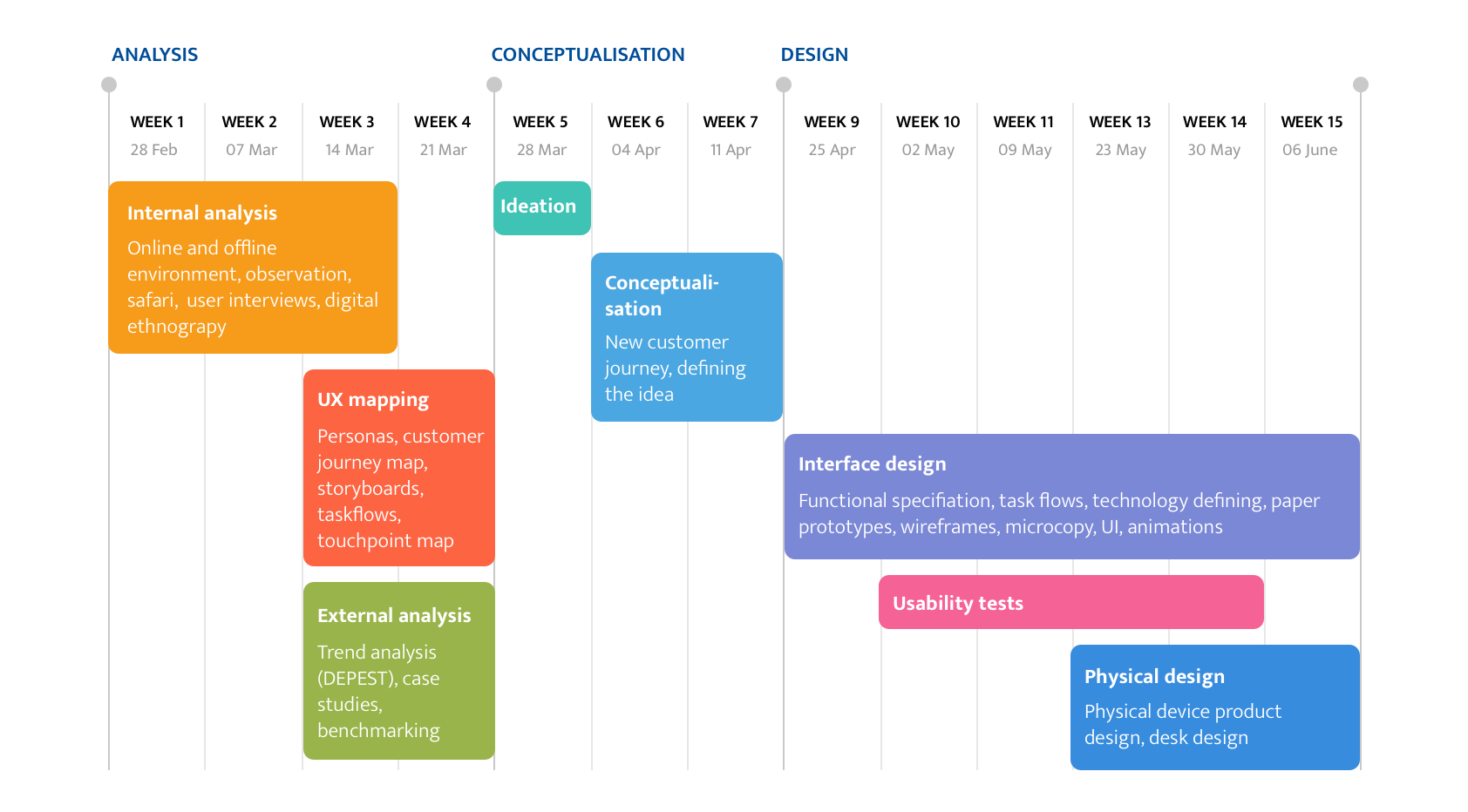
Process
The process consistent of 3 stages: analysis, conceptualisation and design.
Internal analysis
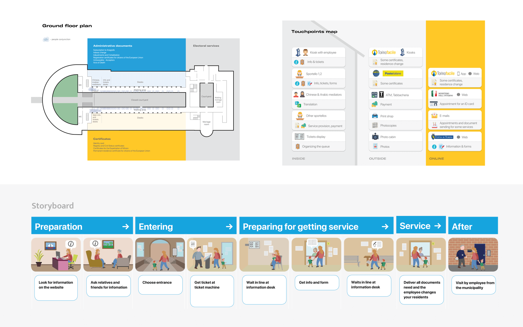
To create a comprehensive overview of the environment, both the online and the offline environment of the Central Registrar's Office of Turin was analyzed.
The activities of the internal analysis included:
- Analysis of the Registrar's Office website and the TorinoFacile online platform, an auxiliary service of the municipality
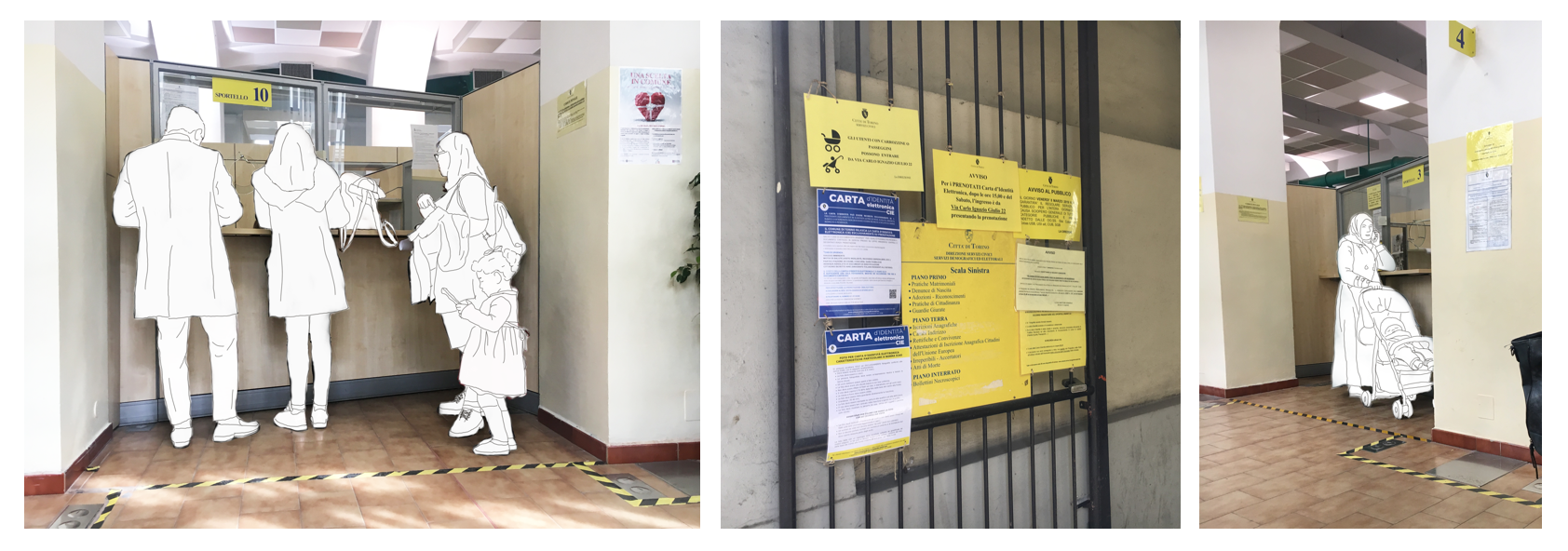
- On-site inspection, observation both the architecture and signposting of the building and the people present there, working or not
- Semi-structured interviews
- Service mapping
- Main personas identification
- Customer journey mapping
User research
To analyse the users on the first stage of the project qualitative methods both attitudinal and behavioural were used. We observed the behaviour of the Registrar's Office visitors, conducted interviews with them. Also digital ethnographic research was conducted: we analysed user reviews on Google maps and user stories in the local newspaper.
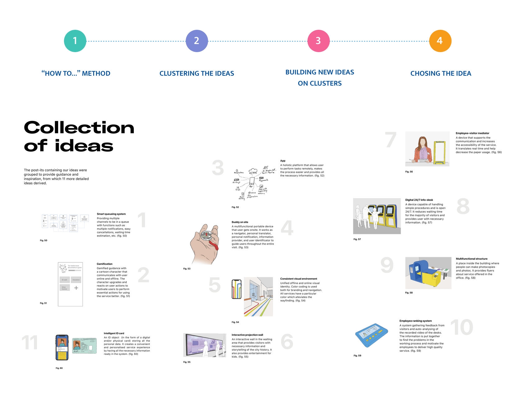
Main problems
As a result of our analysis we identified several problems. For the course scope we could not focus on all of them developing the service solution but had to choose one and propose a digital touchpoint solution. We focused on the following two.
- Even for Italian people the bureaucratic process is not clear, they had to redo their documents several times
- Non-Italian speakers were excluded from the service at all. They had to come with speaker assistants to get the procedure done
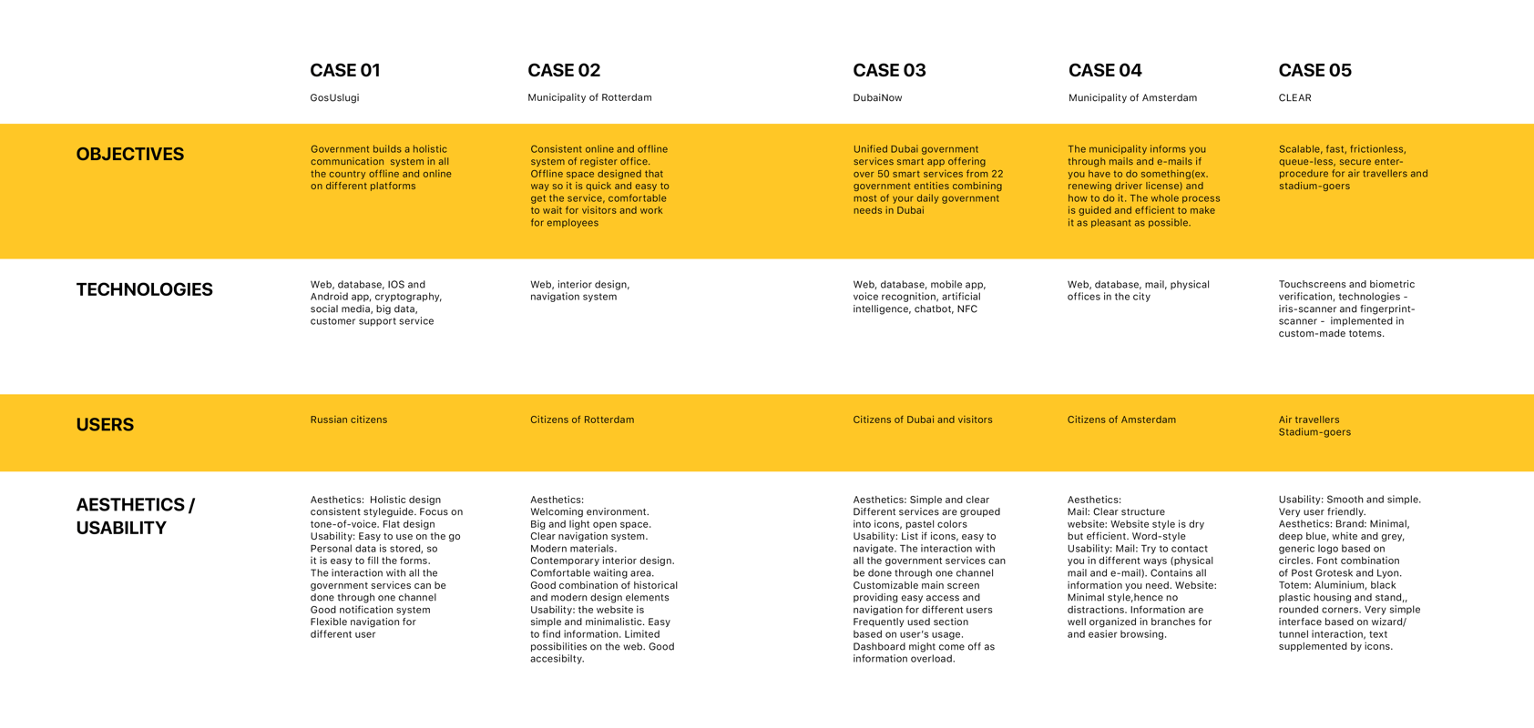
External analysis
We conducted an external analysis of the factors that could inspire us and influence the development of the new service. We conducted:
- Trend DEPEST analysis
- Market research
Conceptualisation
With a concrete base of internal and external analysis, the creative juices could finally start flowing. Our ideation phase follows a funnel model: go broad without limitations to create a wide selection of ideas, then go narrow for choosing the most potential and suitable touchpoint by mapping them onto a matrix to go deep for further development.
Problem focus
In our creative research we decided to focus on young international people who don't speak Italian. International mobility is a trend of recent years and we were eager to find a solution for such people.

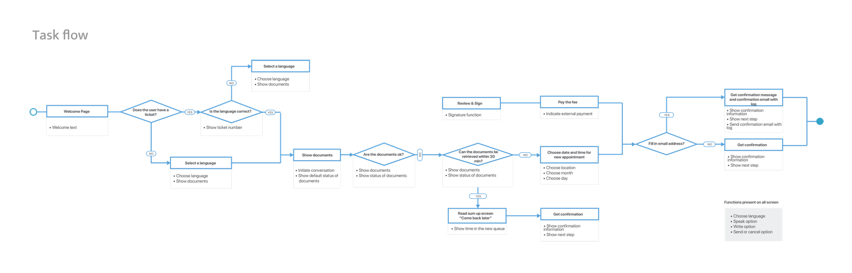
Concept design
Concept design included the following main stages:
- Functional and non-functional specification
- Prototyping (paper, wireframes, hi-fi interactive prototypes)
- Product physical design and desk design
- User testings
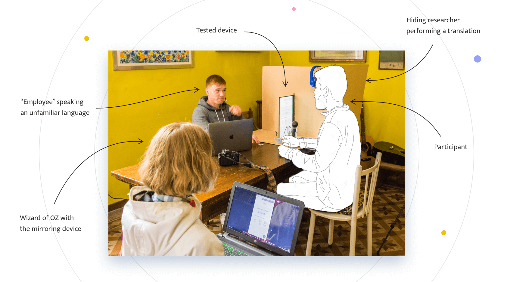
Usability testing
During the design process we conducted several usability testings. First, with paper prototypes, then with interactive ones. Some of our findings were:
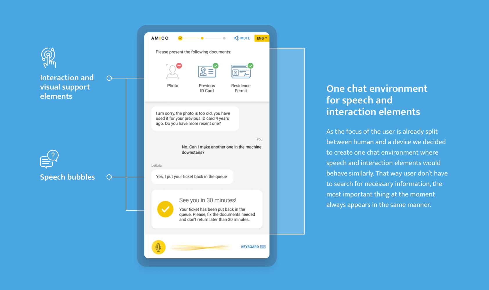
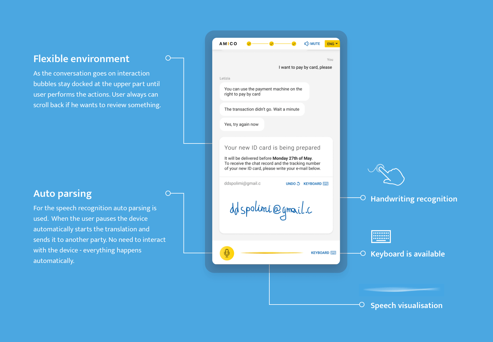
- During the conversation it is very difficult to focus on any other interaction. We tried to avoid the interaction with the device as much as possible, it should be an invisible helper, not a complex machine.
- If the environment is noisy, auto parsing might not work well. We added a sound protective panel in the desk design.
- Participants didn't know what to expect from the device when the employee starts to speak an unfamiliar language. We added visual feedback on speech and ads in the physical space.
- Simultaneous sound and text translation might be overwhelming. We added a possibility to mute the sound
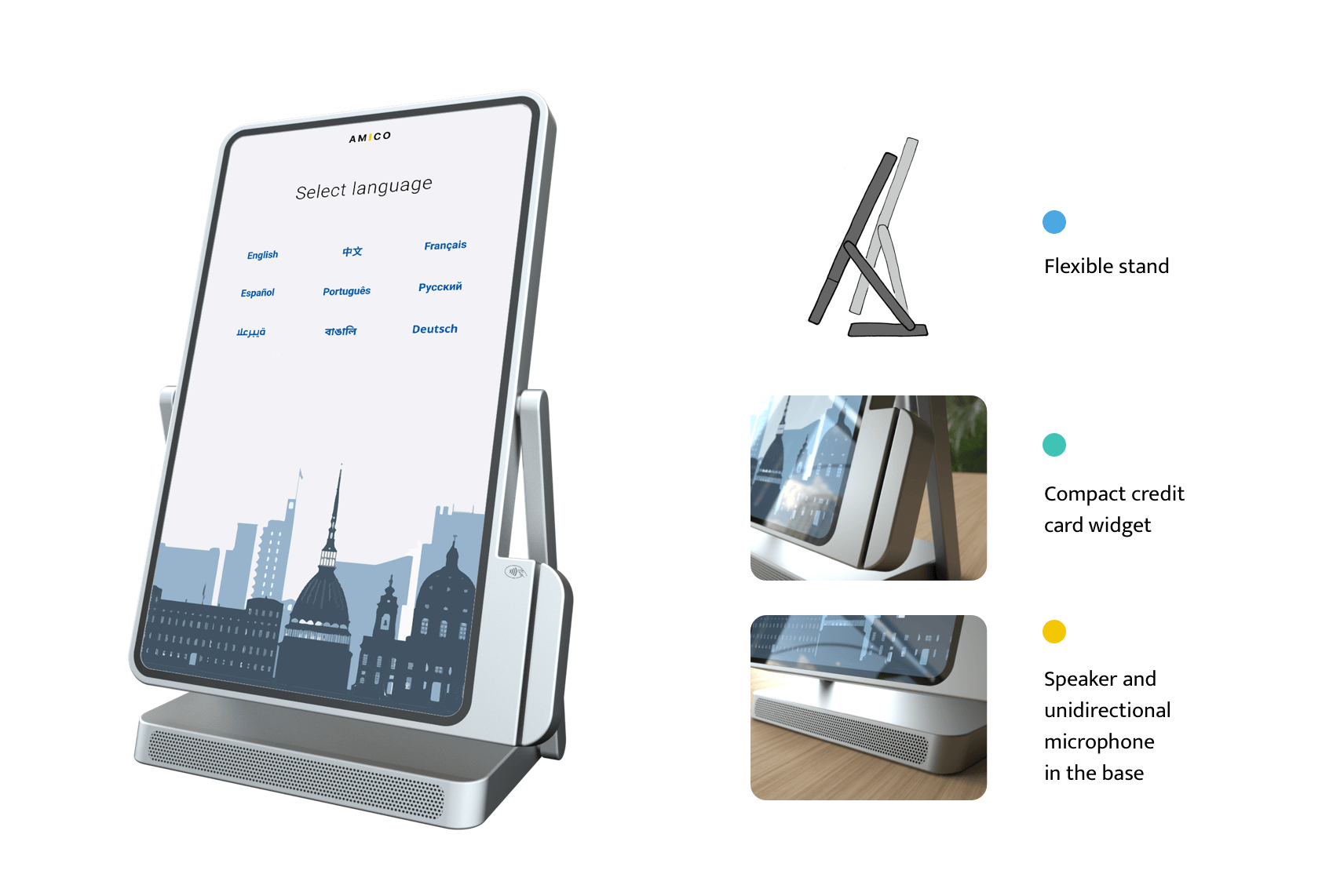
- The tilt of the screen is not comfortable for the interaction. We made it adjustable.
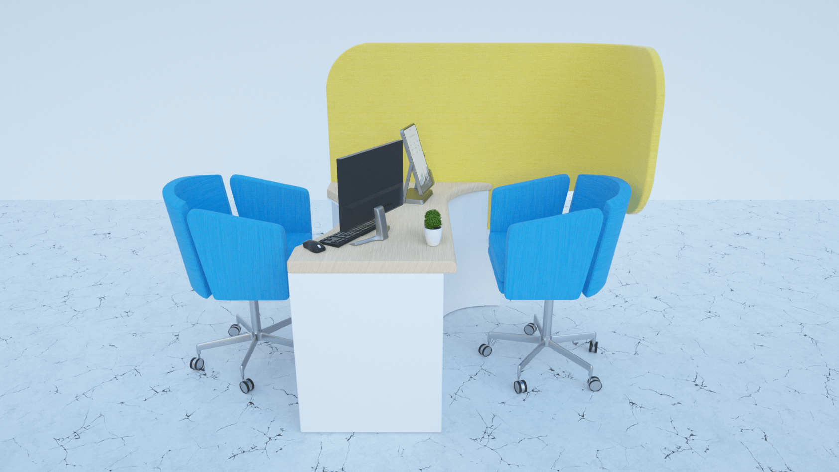
Physical design
The final physical design centres on a desk where the visitor sit down and go through the procedures with the employee. The decision to create a design for sitting was mainly taking into consideration people in wheelchairs. The curved design of the soundproof panels and desk ensure safety but also make the touchpoint more welcoming.
Previous project
Automotive UINext project
Trip2Medic